If I said: “you’re a few calculated steps and tests away from boosting conversions and growing your bottom line.”, would you believe me?
Whether you agree with the above statement or not, it’s true.
I’ve spent 8 years on the Google Analytics team, guided the growth team at Dropbox, and advised numerous SaaS companies. An ever-present factor for success throughout the roles I’ve played and teams that I’ve led, is data-driven optimization that orbits around the user.
Actionable data eliminates reliance on whimsical guesses and “gut feels”. When centered around improving the user journey, it marries knowledge and experience to birth analytical insights that lead to growth.
For instance, here at Leadfeeder, website and behavioral analytics highlighted barriers users faced while browsing our pricing page. After identifying key issues that harmed conversion rates, we tested and rolled out corrective changes. This increased sign-up conversion by 30% and generated $11,000 in monthly recurring revenue (MRR).
Ahead, I’ll explain how to use the same steps—and give you the exact A/B split test plan—we use at Leadfeeder to lower barriers to conversion and boost our site’s bottom line.
Note: If you’re looking for even more ways to increase lead generation, sign up for free Leadfeeder's 14-day trial and give it a try.
Why you need to identify barriers on your site to boost conversions
Some visitors will land on your site credit card in-hand and speed right through your sales funnel.
Others might complete a micro-conversion—like subscribing to your email list—and, after being nurtured, become paying customers.
Regardless of how “warm” visitors are when landing on your site, they’ll all hit barriers that cumulatively weaken your grip on their attention and cause interest in your offer to wilt and waver.
Barriers, or points of friction, are elements on your webpage that trigger psychological resistance while users travel through your site. This causes visitors to stop, slow down, or leave.
The more barriers your site has, the “less user-friendly” it becomes; resulting in higher bounce and exit rates and fewer conversions.
How to lower barriers and raise conversions in 3 steps
Users should be able to flow from page-to-page, seamlessly sliding into the sales funnel and navigating your site without feeling that you’re hard-selling them.
In the words of Jason Goldberg, CEO of Fab.com, “The best-designed user experiences get out of the way and just help people get sh*t done. Less is more. If you have to explain it, you’ve already failed.”
To create that user experience, identify pages where users encounter barriers and what they are, then roll out changes to fix them.
Step 1: Pinpoint where barriers lie with web analytics
Just like a doctor uses rigorous rounds of x-rays and checkups prior to putting a patient under the knife; you need to use data to identify where barriers lie and confirm how they trigger resistance before you prescribe tests and changes on your site.
Can you try to match industry best practices and standards?
You can. But, avoid leading with them.
Generic benchmarks and practices aren’t based on the unique DNA of your industry, personas, and product or service. This means they’re more likely to yield misinformed hypotheses and misleading data.
Treat them as references or sources of inspiration, but not absolute guides.
To identify barriers, use Google Analytics to target pages where users are losing interest on your site. The main pages to investigate are:
High exit pages
High bounce rate pages
High traffic or click-through-rate pages (CTR) with low conversions
Pages with disparate conversion rates on different browsers and devices
If you have multiple pages reporting a high loss of interest from users, prioritize the one closest to your business goals.
The closer the barriers you lift are to your end goal, the bigger the potential uplift in conversion rate. This was the case for the project management solution, Taskworld.
After analytics spotlighted barriers on their sign-up page, Hotjar’s heatmap tool revealed that users struggled with the sign-up form. With a quick five-minute fix, Taskworld was able to boost sign-up conversion by 40%.
There’s a substantial amount of “data-digging” to be done to ensure your actions bear fruit. If you’re serious about fixing barriers on your website, let qualitative and quantitative data lead the way. The rest will follow.
After using Google Analytics to identify barriers on our sign-up page at Leadfeeder, I ensured the team spoke with our customer-facing teams, conducted user surveys, and observed user behavior with Hotjar.
This allowed us to grasp the motivations driving every sign-up, and sculpted critical decisions later on.
Step 2: Diagnose page-specific barriers with the right tools
Web analytics alerts your attention to pages with glaring issues and problematic barriers.
Behavioral analytics, on the other hand, describe those issues in detail. They give a granular ground-view of user activity to pinpoint precisely where barriers lurk.
Below, I’ve listed the tools that’ll not only show you how barriers are forcing users on your page to “resist”, but also aid in forming intelligent hypotheses for the A/B tests that help fix them.
Heatmaps
Tracking scrolls, clicks, and mouse movement, heatmaps illustrate where attention falls and how users interact with a page.
They help us “eat our own dogfood” (use and view our product as if we were our customers) at Leadfeeder, and begin to reveal “dots of intent” that we can later connect to understand issues that users face.
Session recordings
Session recordings are real, user-perspective records of the complete journey and actions of a visitor browsing your site. As well as recording behavior, they also show:
Scrolls and taps on mobile
Keyboard strokes
Page-to-page interaction
Viewing session recordings is the closest you can get to physically standing over your visitor’s shoulder while they browse your site.
They’re a powerful tool for prescriptively correcting barriers, fixing bugs, and enhancing the user experience through empathy.
For instance, when Audiense’s Head of Product noticed a nose-dive in the number of user sign-ups, they spotted the cause within a few session recordings: the password validator feature broke, and as a result, users couldn’t complete the sign-up process.
The team fixed the bug and revived sign up conversions within a few hours.
Important note: When choosing users to record, make sure they align with the segment of visitors that are closer to your business goals or experiencing a potential bug/issue.
For instance, if your inbound traffic is mainly made up of visitors in the USA, UK, and France, but UK visitors are showing higher exit rates and fewer conversions, that’s who you’re going to target.
Website feedback tools
Sometimes data reports one thing, but users do another.
That’s where feedback tools like on-site surveys and interactive feedback widgets help.
Feedback from users lends credibility to your data and gives insight to user intent. At Leadfeeder, we combined written feedback from users with Google Analytics to confirm the barriers plaguing our pricing page.
There’s a lot to learn from feedback tools. You can
Better understand the motivations and intent of a visitor
Uncover process bottlenecks and barriers
Identify different personas and the actions they take
Discover page-specific UX problems
Learn what language visitors use
Step 3: Start testing (How we fixed barriers to generate an extra $11,000 in MRR Leadfeeder)
If you’ve followed the first two steps, you know:
Which high drop-off pages contain barriers to conversion
Where and what those barriers are on your page
Now, it’s time to use A/B tests to lower the barriers that users encounter.
Before you make any tweaks or drastic changes, write down a brief test plan. It doesn’t need to resemble the complexity of a Pythagorean triples equation, but it should detail the following:
Background: Describe the barrier on your page, how it came to your attention, and how it is harming conversions.
Hypothesis: Suggest the changes you will make to fix the issue.
Business case: Explain how the change will impact the bottom line.
Metrics: List the relevant metrics you will monitor in the test.
Estimated sample size and test duration: List the sample size and how long you will run the test. This will vary depending on what you’re testing. A drastic page overhaul will need more time and sample subjects than a single CTA test, for example.
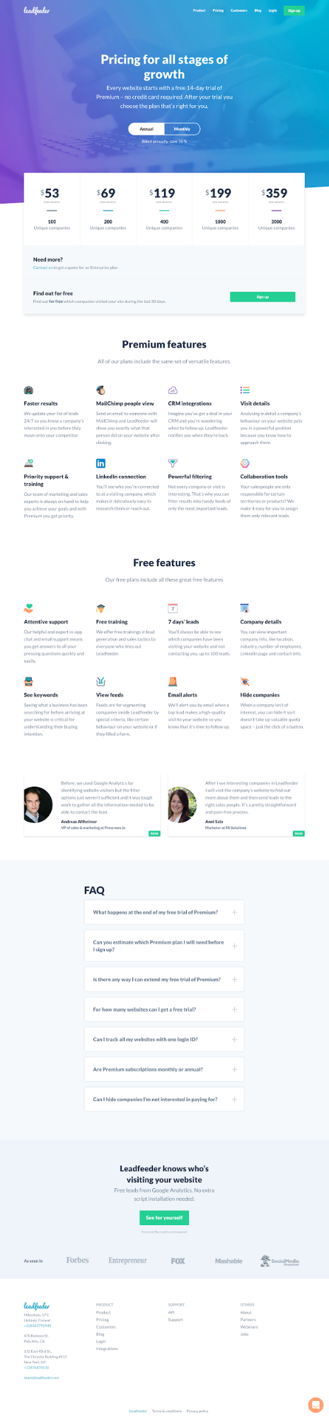
Back to our removal of barriers on our pricing page, here’s what the original looked like:
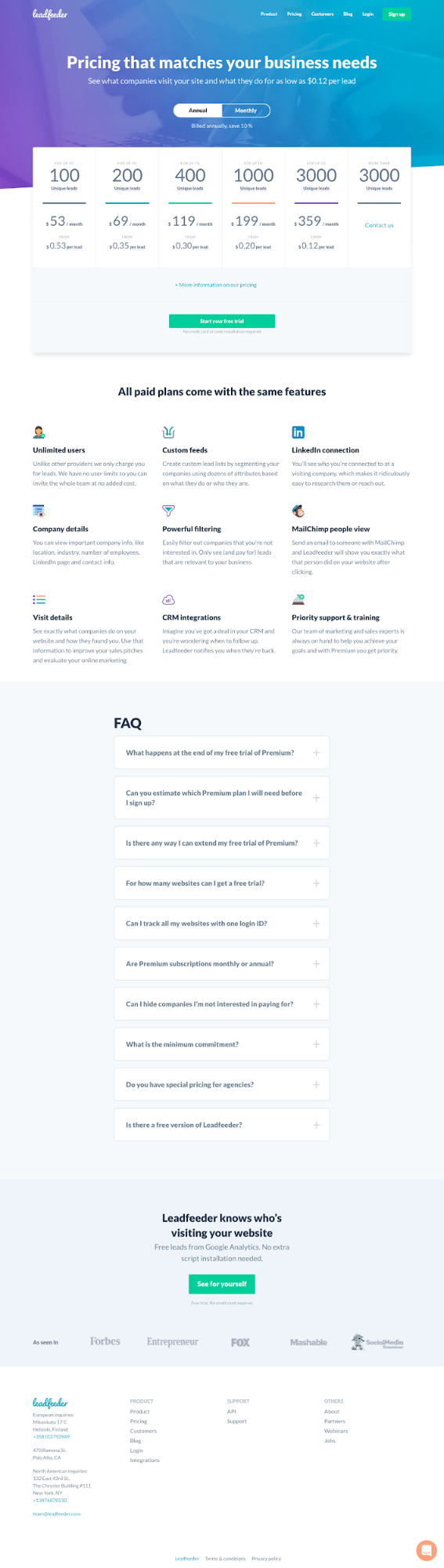
We arrived at this winning variation after executing the A/B test plan documented below:
Background
Users were confused about how Leadfeeder pricing worked. We discovered this through Live Chat interactions and Heatmap data, which showed that pricing plans—that were not “clickable” at the time—were attracting a noticeable number of clicks.
To us, this signaled that users intended to learn more about pricing. And the fact that they couldn’t click was slowing them down.
Hypothesis
We could get more users to start a free “Leadfeeder Lite” trial by:
Making the pricing model clearer
Refining the CTA clarity to communicate to users that they’re not choosing a paid plan
Highlight the benefits and features alongside pricing to reinforce value
Business Case
Proper communication of pricing will lower the barrier from Trial to Paid, resulting in more sign-ups, and an increased MRR.
Metrics
Sign-up starts
Pricing page CTA clicks
Total sign-ups
Estimated Sample Size Required and test duration:
1.5k sessions per variant.
4-week run time
9.5% CVR, 30% lift, 80% power, 80% confidence
Estimate 600 sessions per week
( 20% lift would take 6.5 weeks)
To summarize, the steps we took to successfully lower barriers to conversion:
1. Through user feedback and Google Analytics, the pricing page was found to have enough drop-offs to warrant improvement.
2. With the aid of heatmaps, we realized that a high number of users were trying to click the plans presented on the page.
3. Finally, we tested clickable plans (amongst other changes), got a 33% conversion rate boost, and generated an extra $11,000 in MRR.
Final notes
I’m often asked about the most valuable lessons I’ve gleaned from my time at Google. And to be honest, it’s difficult to distill everything into a digestible sentence. But, the three main maxims that have stuck with me over my 8-year tenure are:
Data beats opinions
Launch and iterate
Focus on the end-user and all else will follow
These rules still ring true today and have served me well throughout my career. Combine them with tools and processes highlighted in this post, and you will be just a few calculated steps away from wielding the power of data to drive growth—just like we’ve done, and continue to do over at Leadfeeder.
Note: If you’re looking for even more ways to increase lead generation, sign up for free Leadfeeder's 14-day trial and give it a try.

Anna works as a SEO Consultant and writer for Search Engine Land. Over the last decade, Anna has successfully developed and implemented online marketing strategies, SEO, and conversion campaigns for 100+ businesses of all sizes; from the Fortune 500, to startups, and nonprofits. She enjoys burritos and puppies (in that order).
Now that you're here
Leadfeeder is a tool that shows you companies that visit your website. Leadfeeder generates new leads, offers insight on your customers and can help you increase your marketing ROI.
If you liked this blog post, you'll probably love Leadfeeder, too.
Sign up

